Mint.com and Power BI – Updated Reports and an Even Deeper Dive
“A main goal with this project has been to show how the ‘democratization of your data’ means you can answer questions using modern, powerful BI tools, aside from what existing sources (like mint.com) can provide.”
In my prior article Using Mint.com and Power BI to Visualize Your Personal Finances, I introduced a Power BI report that uses data you can easily export from Mint.com, visualizing your personal finances in new and interesting ways. My work on this hasn’t stopped: I’ve made several improvements and introduced a few new report pages. This updated .pbix file is available for free download from here (MIT license). Note that I’m now including both the .pbix file and the source .csv data in a .zip file.
As part of doing the download, I’ve been asking a few questions - thanks to all those who’ve participated! From that, it’s become clear that a lot of current interest stems from a “personal finance” angle, as opposed to the “BI developer” angle. That said, I’m a BI developer, so it’s impossible to separate the two facets. A main goal with this project has been to show how the “democratization of your data” means you can answer questions using modern, powerful BI tools, aside from what existing sources (like mint.com) can provide. We can thank mint.com for supporting a data export option that some other fintech providers might fear to do – and take advantage of the “aggregation and categorization” features it provides for free. (I’m loath to re-invent a wheel that works well, but more on that later.)
The remainder of this article is dedicated to exploring the latest version of my report, focusing on how it relates to specific personal finance issues. I’ll touch on some of the technical elements in a dedicated section towards the end, so if that’s not your thing, you can skip it.
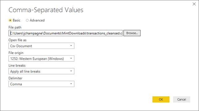
After you’ve downloaded the .pbix file, you can open it using the Power BI Desktop app. (Be sure to be using the latest version: 2.0 uses some features that require the November 2018 build and later.)
You should see this, after opening the file:

A key change compared to 1.0 is most reports “cut-off” as of the date of the last available transaction. This means if you open a file that has previously imported data up to 12/28/18 (like the sample data in 2.0), you’ll see the same visualization results, no matter what month you’re currently in. Recall how to get your own data into this report:
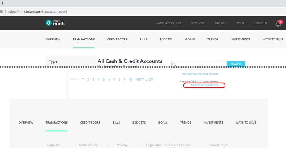
1. Extract your full transaction list from mint.com. Look for the “Export all transactions” link:
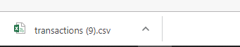
2. Note your download file:
3. Go to Data Source Settings:
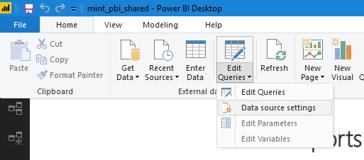
4. Select Change Source:
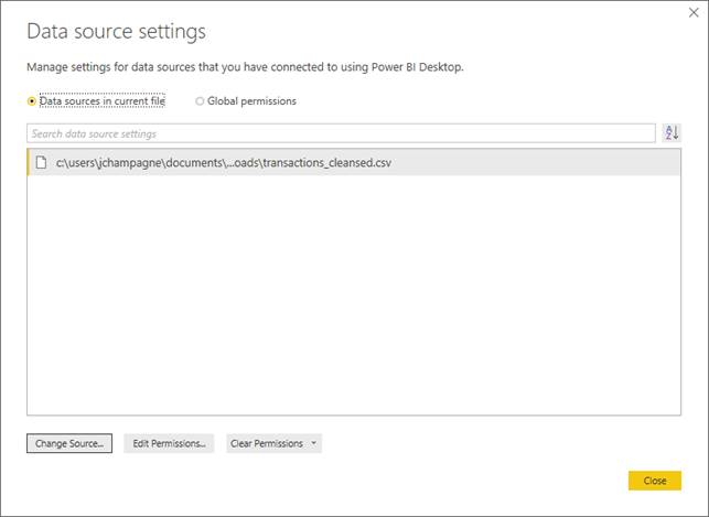
5. Select your download file:
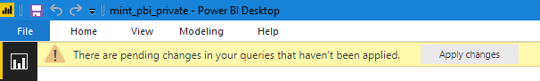
6. Apply Changes, as needed:
Voilà! You should see the Summary dashboard update to reflect your current state. I’ll continue by presenting the sample data, as if it were mine. (If you’re interested in how I scrambled the data to maintain a semi-realistic tint but obfuscate my personal details, I explain it more here.) Once you’ve established the source file for your data, you can skip steps #2 through #6 and just hit “Refresh” after downloading your mint .csv file (assuming it’s the same name and location all the time).
The Summary page offers a high-level overview of your current financial state by picking a handful of key metrics we can find (directly or indirectly) on other pages. Let’s look at the KPI’s shown:
Net Cash Flow: The “bread-and-butter” of income minus expenses. Keeping this above zero is, of course, ideal! Three different time-frames are presented: current year, prior 6 months and prior 12 months.
Projected Net Cash Flow: This one is like net cash flow, but it applies to the current month, and if the month is incomplete, we use a “forecast” amount to complete it. This forecast is taken by looking at the last 6 months and averaging net cash flow for the remaining days of the month. For example, if it’s December 15th, we use June through November’s 16th through 30th (or 31st), averaging the per-month net cash flow. We add this to the actual cash flow for December 1st – 15th. You can find this same figure on the total line of the Day of Month page, for the “Cum CM with FMF ” amount. Again, this is only an estimate, but should account for regularly scheduled up-coming transactions and general patterns.
Savings Goal Progress: I’ll cover this metric more when discussing the Savings Tracker page. You should be able to spot the ($1,496) on that page, near the lower-right corner. I’m pulling it onto the Summary since it’s one of the more important metrics. This measure is shown using a third-party visual (free) that lets us include a trend line.
Month by Year shows spending during the prior two years plus the current year, with months side-by-side. For the current year and especially the current month, showing actual spending might be useful but is not predictive. To be predictive, we’d try to anticipate our future spending. There are different ways to do this, from simple to complex. One fairly simple way is to look at what we spent in the prior year on the same date (in the future). This hopefully accounts for things like recurring payments which might occur on regular days of the month – or even days of the year. It’s also worth grouping by month to address seasonality patterns (anyone with kids in summer camps?!). It loses accuracy when we have life event changes; for example, we finish paying off our car, get a new mortgage payment, etc. Look for a version 3.0 to include even more intelligence options (if there’s interest).
The Discretionary report shift from a by-month to a by-year view – still focusing on expenses. In fact, it attempts to separate expenses into “discretionary” versus “fixed obligations.” The default behavior is to zoom in on the discretionary side, since we assume these are the type of expenses that we have a hope of possibly changing. For fixed obligations like mortgage payments, car payments, etc. - we certainly need to account for this in our budgeting, but changing these amounts is usually a big deal (e.g. a refinance) and looking at these amounts year-over-year is likely to show little change (borrring!). The tree-maps compare selected year actuals versus full-year forecast amounts, based on the same forecasting rules described for “Month by Year.”
Day of Month focuses on both spending and net cash flow. There is one line per day of the month, with most measures determined by looking at the past 6 months. As interesting as the figures are per day, the totals give an important perspective. Let’s consider this example:

Cumulative Avg After Today represents how much net cash flow we might expect after the last day of available data through the end of the month. Cumulative Avg Total represents average net cash flow for the whole month, using the last 6 months as a basis. We could cross-check this value of $290 by seeing that we had $1,740 of positive cash flow over the last 6 months, in total. Cumulative CM (current month) Signed Amount with FMF (Full-month forecast) says we’re currently on track in the current month to have had a net cash flow of $2,816 – so a very good month compared to average! That fact is supported by the next two values that show actual expenses for the current month are considerably less than in the prior month.
Month Progress is a close relative of Day of Month, showing how closely you’re tracking to the average spending of the last 6 months. Mint has a similar report, but it’s based on strictly the prior month. Using an average means one “weird month” (i.e. the previous one) doesn’t skew the comparison with the current month - as much.

Net for TTM (trailing twelve months) is a dense line chart, with every single date over the last year on the x-axis. Here, changes in net cash flow is on display, starting from a base of $0 on the far left. A trend line has been added and we, of course, would like to see it pointing upwards! An upward trend implies we’re taking in more income than expenses and could mean an increasing bank account balance, transfers to investment accounts, etc. It’s also possible excess funds could exit your “mint.com-tracked-universe” as debits (not transfers) in order to fund similar things, in which case a flat trend line is perfectly fine, too. A negative trend is almost always something to proactively address, however!
The Cum TTM page is new and borrows some ideas from the previous page, namely showing cumulative change of net cash over time. The approach is different, however: instead of starting at $0 on the left side of the chart, we start at $0 on the right side. The blue bar is the net cash for the month. The black bar shows cumulative excess/shortfall. The red bar does the same thing as the black bar, except it “starts” with the prior month. Why? Including the current month may be misleading if say your mortgage payment comes out on the 2nd of each month but you aren’t paid until the 15th – if you were watching on the 14th, it might seem like you’re way behind where you want to be, but when the month is viewed in totality at the end – you might be just fine! I offer both ways to look at things since your situation might work using either approach.
Best Months is a new page that sorts our net cash by month and takes a “top 4” – both for good and bad months. If you click on one of the months listed near the top, the remainder of the page filters to the selected month. This lets you explore at a category level to see what went well (or not-so-well for the selected month). Hopefully you can pull out some concrete ideas, although in some cases it might be simply explaining what happened (e.g. “that darned car transmission!”).
Inc Exp by Month is a rehash of monthly net cash. Yes, I admit that I’ve given a slew of different ways to see this important measure – but this page offers a “play” control that’s available for free in the Power BI marketplace. Clicking on the play button causes the slicer to increment the month, every 2 seconds. The “Net” KPI card offers a text “opinion” on how you’re doing in the filtered month, as well. How is it determined? By looking at your ratio of net cash to income – so messaging should be relevant whether your income is $30,000 a year or $300,000 a year.
For a lot of people, food, transportation and housing are among their largest expenses – where transportation and housing are things you can control but once you’ve gotten to where you want to be with them are not likely going to change much! The Food page is inspired by my own desire to keep closer tabs on my food spending, per month. Changes in 2.0 include using a KPI with a trend chart; the number shown is for the current month, but the background trend line is useful to compare over more months than just the 6 shown in the bar chart on the bottom of the page.
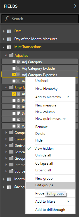
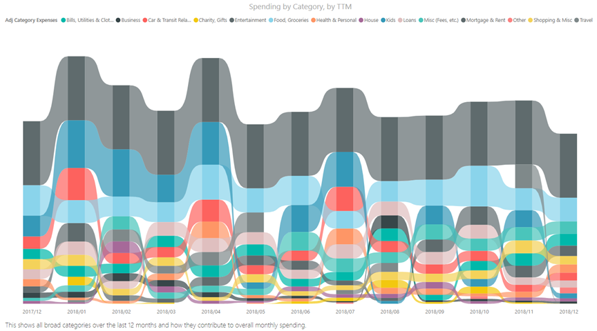
Category Summary is a new ribbon chart that shows how various high-level categories contribute to our overall monthly amounts – and how they “flow” between months. This readily shows if say food was in “third place” last month and “sixth place” this month – you can follow the ribbon along, with the stacked bars sorted to show the largest expenses toward the top. Changes in overall positioning are easier to spot if you click on the text shown in the chart legend: doing so highlights the category for all months. How are these categories determined? I’ve taken the categorization that mint.com has done and created another layer of grouping, right within Power BI. The alternative of updating potentially thousands of transactions in mint.com was unappealing! Instead, things like “Fast Food,” “Groceries” and “Lunches” which are assigned by mint.com, all become “Food, Groceries” in the “Category Expenses” (and “Adj Category Expenses”) group. If you’re not happy with my mappings or if you have different mint.com categories than I’ve used, you really must update these category groups (on an on-going basis). Go to the group in the field list, click the ellipsis, and select “Edit Groups”:
Similarly, the Category Exclude and Category Include groups should be maintained to convey specific meanings.
Category Expenses: Buckets that are specific to expenses. We can allow income to fall into the “Other” group.
Category Exclude: The important buckets here are “Income” and “Real Expenses”. Other groups such as “Transfers” are often excluded from reports, which gives this group its name.
Category Included: This should cover most categories presented by mint.com, where we distinguish “discretionary” versus “mandatory” expenses, split from income. We are less frequently excluding based on this group, but we can. I don’t love these names, they might change in version 3.0 😉.
Category Detail offers what amounts to a drill-down based on the categories we see on Category Summary. For example, here we’re looking at individual vendors that make up our “Food, Groceries” grouping for any given month.
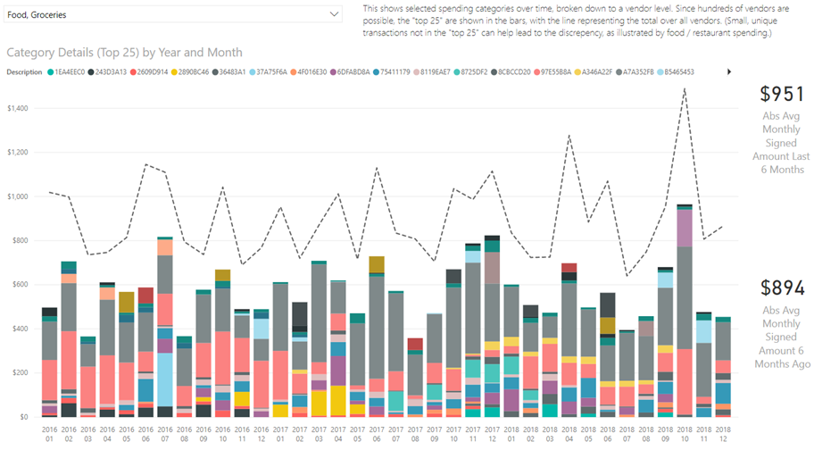
Now, we could end up with potentially hundreds of vendors involved, so this page zeros in on the “top 25” for the bars. The dashed line represents the total amount for the category / month. We can see with Food, especially, there’s a decent gap which speaks to the fact we might be trying a lot of different food options – many tried not enough to make our “top 25,” though. (To be fair, we’re also subject to mint.com rules where I’ve seen the same vendor included multiple times with slightly different spellings – I’m ignoring that mostly for now, with the higher-level category being used far more often in these reports.)
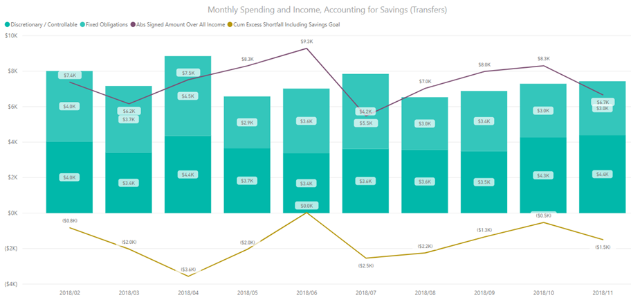
The Savings Tracker page is new and is designed to help you maintain an accurate view of cash flow, depending on how you’ve chosen to reflect moving monies for savings, inside mint.com. If you, for example, transfer a fixed amount of money each month from a primary checking account, to a savings account: this to mint.com might be called a transfer, which in my reporting is largely ignored. Why? Because transfers are not changing your overall net household value. However, that’s still a certain amount of money you should consider yourself not having “access" to. The “Cumulative Excess/Shortfall Including Savings Goal” measure shows your net cash flow, accumulated over each month, additionally deducting an amount that you can set. In the example here, we’re not doing well: we’re tracking below zero, starting from a date we can set as our “savings start date”:
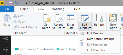
The date and amount are stored in the Power BI report, not in mint.com. We can set/change these parameters by:
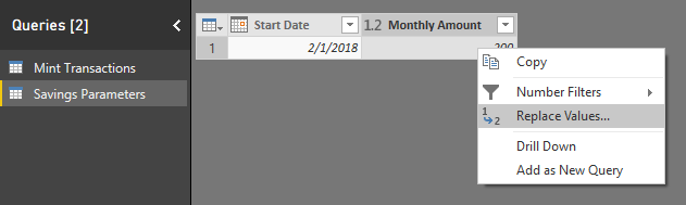
1. Select “Edit Queries”:
2. Pick the “Savings Parameters” table:
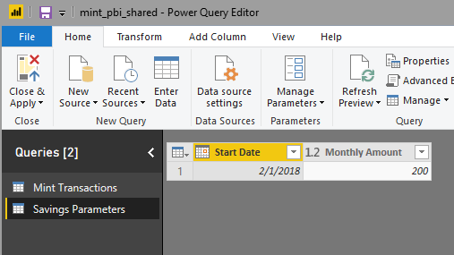
3. Don’t like the date or the amount? Change it with Replace Values:
There’s more we can do with this concept, certainly – but at some point, trying to do it all inside of Power BI becomes harder than it should be, and an application is warranted. (We could debate using a designer tool to “render” our reports, too – but it does work, and it is free, so there’s that 😉.)
Finally, the Income page is designed to show just that: income alone. Do you have a variable income? This page can answer the question: What’s the monthly median?
The idea of “paying yourself first” is not new. If you set up a scheduled, automatic transfer of funds out of a primary account (e.g. checking account where maybe your paycheck is deposited to), the theory is you’ll be less tempted to “spend your savings” and just spend within the amount that’s left-over after the transfer happens. Another practical reason is you want to put your extra funds to work for you and having them sit in a low-interest checking account isn’t a great way to do that, in many cases.
From a mint.com perspective, you can often add investment accounts to what is tracked. However, doing so doesn’t necessarily tell a complete story. For example, imagine you transfer $1,000 from your primary checking account to a brokerage account. Mint can see that as both a debit and a credit, potentially. (If it only sees one of those two transactions, you have an issue to address: your net worth should not change by the simple movement of money.) Now you use the $1,000 to purchase “x” shares of company ABC. That isn’t something I’ve seen in Mint as a transaction that can add meaning. (That too is like a transfer: you’re exchanging cash for shares in a company, at a point-in-time.) After that, any capital appreciation or loss is something Mint can see – e.g. it can show you what the balance is in your brokerage account (with some caveats – I’ve had varying luck with this!), but from a data export perspective, that’s not something you can see. We need a more integrated reporting solution if we want to analyze net worth. I started to attack this with a concept app called WiserRobo, which I’m happy to revive with enough support (you can voice that when you download the 2.0 Power BI file).
Another consideration when dealing with tracking your net cash flow is how you want to handle things like loans. The best way is to likely consider loan proceeds as a type of income (not payroll income, mind you), and your loan payments become an expense. If you received $10,000 in loan proceeds, for example, and pay it back with 50 payments of $250, you’ll have a net cash flow of negative $2,500 by the last payment, reflecting the interest paid of $2,500.
What if you received your loan proceeds before you started using Mint? That becomes a murkier answer. Ideally you should keep the number of steps involved in doing this reporting to a minimum, so one option is to manually add transactions to Mint. You could also ignore your loan payments for the purposes of reporting, calling them an “external expense.” Better yet, call them non-discretionary expenses that do impact your ability to have positive cash flow until the loan is retired. Much of the reporting I’ve done deals in “trailing twelve months” so you’re not going to see the loan proceeds from two or three years ago (or more), anyhow – but in the future, the original proposal of including every transaction is best to have the ability to create an accurate picture of what came in and out, net.
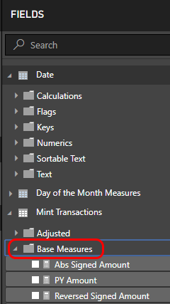
You may have noticed that the field list has changed since version 1.0. Now every field has been put in a meaningful folder:
The ability to use folders was added in a more recent version of Power BI and speaks to the benefits of keeping up-to-date. You can assign folders to fields easily using the new “modeling view.” You need to enable this using “Preview features” on the Options screen:

When enabled, you can assign folders here:

When your model grows, organization becomes even more important, so this is a great feature to take advantage of.
I’ve also introduced the concept of an “Adj(used) Category” (shown above). This has been added to explicitly support reimbursable expenses but might eventually support other features. The handling of reimbursable expenses assumes that you’ll ultimately see repayment for the item under “income.” (If your situation is different, this won’t work as I explain it here!) We might, for example, expect two different transactions such as:

In mint.com we can get “Labels” to reflect this in our export file by tagging transactions as being reimbursable:
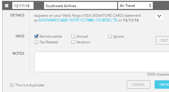
If our regular paycheck was expected to be $1582.56, we’ve submitted an expense to our employer, and they’ve reimbursed us by adding $206.59 to our paycheck. Our “adjusted category” transforms what would normally look like “air travel” into “income” – and it’s left as a debit. How does this help? The “adjusted signed amount” field remains a positive $1789.15 for income but shows a negative $206.59 for our air travel transaction, which recall is treated as if it’s income. What’s the net effect? We see $1582.56 of net income, which matches the income we’d have expected without the reimbursed transaction. It’s as if this transaction magically disappears from reporting, which is good: our employer paid for our flight and we didn’t really get a bonus to take said flight (unfortunately ☹)! I replaced all use of “Category” with “Adj Category” and related groups throughout all measures and visuals – and I’ve therefore marked the original “Category” and related fields as hidden.
There are other “minor tweaks” that have been applied in 2.0. I don’t have a complete change log, but as one example, the Net for TTM page previously was using a filter to the “current year.” This was okay until it turned January 2019 and suddenly the page was virtually blank! This was easily solved by moving to a “trailing 12 months” filter, instead. It’s an example of report design that’s a skill all unto itself - beyond the data skills required to write calculations using DAX.
As mentioned above, “adjusted category” magically transforms transactions marked as “reimbursable” to look like negative income. How? Here’s the calculated column:
Adj Category = IF([Labels] = "Reimbursable", "Income", [Category])
This works because I categorize some of my income-based transactions in Mint as “Income,” and my category groupings are aware of this. (Most measures work with the groupings, not directly with categories.) Using multiple tags is not currently supported.
Another new measure is:
Reverse Cumulative Signed Amount = CALCULATE(SUM('Mint Transactions'[Signed Amount]), FILTER(ALL('Date'[Date]), 'Date'[Date] >= MIN('Date'[Date])))
This differs from a traditional cumulative measure in that it starts at zero at the end of some date range, not the start, and accumulates over prior periods.
Another interesting cumulative measure is:
Cum Excess Shortfall Including Savings Goal =
VAR x = [First Selected Date]
RETURN
CALCULATE(
CALCULATE(
[Abs Signed Amount],
ALL('Mint Transactions'[Adj Category Included]),
FILTER(ALL('Mint Transactions'[Adj Category Exclude]), [Adj Category Exclude] = "Income")
) -
CALCULATE(
[Abs Signed Amount],
ALL('Mint Transactions'[Adj Category Included]),
FILTER(ALL('Mint Transactions'[Adj Category Exclude]), [Adj Category Exclude] = "Real Expenses")
),
FILTER(ALL('Date'[Date]), 'Date'[Date] <= MAX('Mint Transactions'[Date]) && 'Date'[Date] >= x)
) -
((DATEDIFF(x, MIN('Date'[Date]), MONTH) + 1) * MIN('Savings Parameters'[Monthly Amount]))
The nested CALCULATE’s remove category filters in favor of income, less expenses, where the outer CALCULATE applies that difference cumulatively. We use “x” as an intermediate variable, from [First Selected Date] which is:
First Selected Date = CALCULATE(MIN('Date'[Date]), ALLSELECTED('Date'))
This ensures we’re starting accumulation with the first date, as we might see it on an axis. Using [First Selected Date] inline doesn’t work – it’s affected by the filtering inside the CALCULATE where we really want the absolute first date as a scalar, which the variable “x” accomplishes. Finally, we’re subtracting our savings monthly amount, multiplied by the number of months after the start date (effectively, cumulative). This is a key metric on the Savings Tracker and Summary pages.
What do you want to see next? Feel free to leave comments here as one way to ask! That can include enhancements for reporting, but also encouragement to do something bigger.
I’ve shown at length in these two articles about Power BI and Mint.com how you can do a lot of good things, very easily, for free, but there are limitations from Mint – and some annoyances. As one small example, I recently had a duplicate transaction show up and I had to manually remove one – not fatal, but annoying, among other annoyances such as the classification system not always being “right.” I find myself having to cleanse transactions actively. Ideally, we could have a system that has similar source data, married with brokerage data, married with market data, etc. – and have a cool way to see it all, driven by what you want to see and how you want to see it.
NEITHER MYSELF NOR THE INFORMATION PROVIDED ARE INTENDED TO PROVIDE LEGAL, TAX OR FINANCIAL ADVICE. I AM NOT A FINANCIAL PLANNER, BROKER OR TAX ADVISOR. The Services are intended only to assist you in your financial organization and decision-making and is broad in scope. Your personal financial situation is unique, and any information and advice obtained through this may not be appropriate for your situation. Accordingly, before making any final decisions or implementing any financial strategy, you should consider obtaining additional information and advice from your accountant or other financial advisers who are fully aware of your individual circumstances.
If you liked this article, you might also enjoy:
Did you like this article? Please rate it!