xSkrape Table Compare Add-In: Users Guide
“The xSkrape Table Compare add-in is a rather simple tool that offers
powerful options to compare tabular data in your Excel workbooks.”
We’ve had the xSkrape for Excel Add-In available in the Office Store for a few months now, and we’re now moving in the direction of splitting it up into smaller add-ins. This helps do several things including:
- We can offer some low-cost functionality such as the new xSkrape Table Compare add-in – largely because it uses strictly “client-side” processing with very minor dependency on our back-end services.
- We can say more about each individual add-in, rather than try to sell a single Swiss Army Knife. In the longer run this helps us too, to understand your needs.
- We can be more agile with respect to “micro-features” – we can deploy smaller units of code, which benefits everyone!
The xSkrape Table Compare add-in is a rather simple tool that offers powerful options to compare tabular data in your Excel workbooks. Its main features include:
- Compare “similar” data between tables (i.e. the columns do not have to be exactly the same)
- Pick columns of interest (i.e. can be a subset of all available columns)
- Color-coding of results let you see differences easily
- Multiple output formats
- Identify subsets of interest (e.g. values in both tables but some difference between them)
- Options such as "case insensitive" compares
- Good performance even with large data sets
Once you install the add-in from the Office Store, you can activate it using the Table Compare command, on the Data tab:

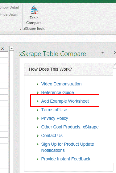
We’ve included an option to add sample data to your current workbook as a way to get familiar with the tool and its features. Simply click on the “Add Example Worksheet” link:
Our example data includes the addition of two tables on a new worksheet. To pick up these changes, click the “Refresh Table List” link:
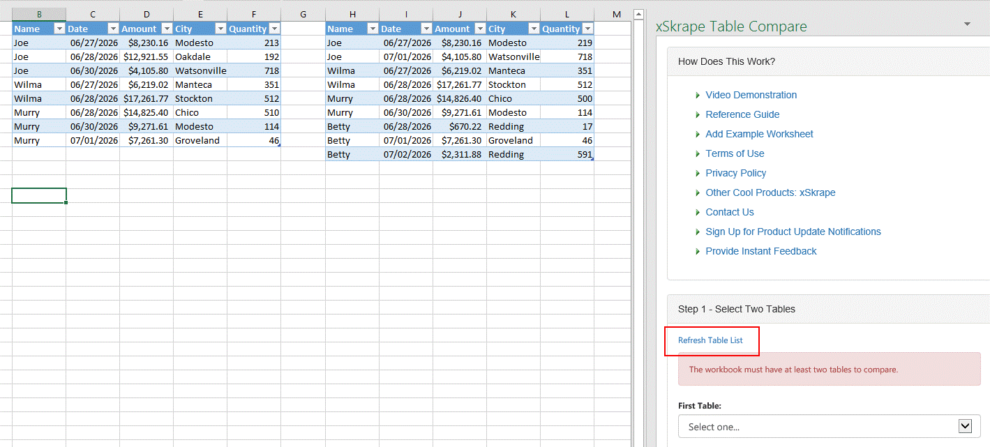
Now we can select the two available tables:
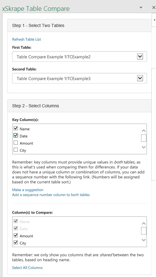
Furthermore, we need to pick one or more “key columns” that are used as the basis for our matching between the selected tables. If you have one column that’s unique in both tables – be it a name or code or some other value that uniquely identifies each row – then you can simply pick it, or clicking on the “Make a suggestion” link may identify it as well. In our example here, notice that Column B shown above includes names – but they are not unique (i.e. they repeat). However, by including the Date (Column C) as a second column in our “key”, the values when looking at columns B and C together are unique in both tables. The Name / Date combination in this case serves likely better than say using the Amount column, since although the amounts are unique, they don’t really describe the nature of each row in the tables: it’s really just “information” about say work a person did on a certain date (as our data tends to imply).
Of note, in our “columns to compare,” by selecting Name and Date as key columns, we must include these in our compare of data values (implicitly), but we can also “opt out” of comparing some other fields, if we like. For example, a timestamp may be different for every record, and including that would show differences for everything (needlessly, if our core interest lies with other fields). Also, we’re only presented with columns that are shared between the two tables, since we assume any “extra” fields are not comparable.
Once we’ve established the tables and columns to use, we can decide how to render our compare results:
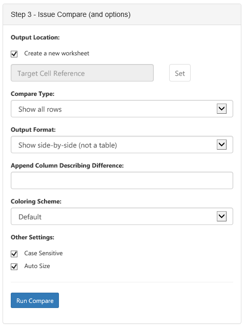
With these defaults, clicking “Run Compare” adds a new worksheet and shows our two tables, side-by-side:
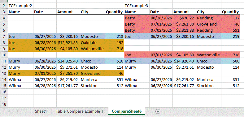
Of note, rows where the key column values are the same allow data to show on both sides of the output. If there are any differences in non-key fields, the row is highlighted in blue, and the actual cells with differences are shown with light blue background. This offers a quick “at a glance” view of what’s actually different. If we use the “Append Column Describing Difference” field and give a column name of our choice:

Notice that a Type column has been included with text that describes each row. If we change the Compare Type to “Show only rows with any differences,” we get a different output:

Notice that rows previously identified as “Same” are no longer included. We can use this to effectively identify differences of interest.
Another option available is to change the Output Format to “Combine in a single table.” This produces output that looks like this:

The key difference here is we’re presented with all unique key values first, followed by our “difference type” column (if specified), followed by data columns – paired between first and second tables. This affords a different way to look at the data, with all the benefits of being in an Excel table (filtering, sorting, etc.). If we choose to use an output table, be aware that re-running the compare will replace the existing table, even if you have the “create a new workbook” checkbox checked.
What happens if your source data doesn’t have a unique key column? You can click the “Add a sequence number” link in Step 2, which will add a “RowID” column to your source tables (be sure this is acceptable!), and will allow comparison based on the existing row ordering in the tables.
Finally, the “Make a suggestion” link can be used if you’re unsure about the character of your source data. This operation will search each column for uniqueness over both selected tables and if a single column can be found that is unique, it’ll make that as a “suggestion.” Keep in mind, this isn’t always the optimal choice (as our example above shows), although technically it should at least work.
Come see how our other products share the same dedication to rich features. We’re interested in your feedback to continue evolving meaningful features in all products! (If you like the kinds of tools we’re building, feel free to ask us for consulting help, as well, related to your own app dev needs.)
Did you like this article? Please rate it!